Tuesday 30 December 2014

Catalogue of Eras: Freemans - Autumn and Winter 1979

It's Christmastime... there's no need to be afraid... That's because your Mum bought all your presents back in October using her Freemans mail-order catalogue. Who needs to go into a shop to buy Christmas gifts?

Back in 1979, the home shopping boom was in full swing as women up and down the UK (never men, of course) were filling out their application forms to stock up on everything they needed for a Yuletide to remember.

But what to get for little Johnny, the football-mad little scamp whose very existence revolved around soccer? To begin with, how about Freemans' wide selection of boots? From the gorgeous red stripes on the Adidas Inters to the stomach-turning green stripes of the Adidas Madrids, there was something for everyone and every budget.

Personally speaking, I had a pair of boots similar to the Gola Speedsters (pictured left, F) when I was young, but in all honesty I was rather ashamed to wear them most of the time. My reasons were twofold. Firstly, they had moulded studs. For any eight-year-old wanting to look his mates in they eye with pride, moulded studs were a complete no-no. Only 'proper' studs would do if you were to convince everyone you were the next Kevin Keegan.

Secondly, the name Gola equated to 'Cheapo' back in the late 1970's. An esteemed heritage in the manufacture of sporting equipment they may have had, but they were no Adidas and all my mates at school knew it. I therefore tried my best not to be seen in public sporting my Gola boots for fear of being pointed at and laughed out of town.

A pity, then, that Freemans had so many pairs of Gola boots on sale in their catalogue, but I dare say many children of my age ended up owning them. Either that or they're decomposing horrendously slowly at the bottom of a million and one landfill sites.

But hey - you don't have to be playing football to wear your nattiest footwear! When mooching around the house, you could still look the part (and look a prat) with a pair of 'soft fabric slippers with football scene vamp-print', whatever the hell that was. Perhaps that's shoe-making terminology for 'blurry image of the 1979 FA Cup Final'. Alternatives were available showing Kermit the Frog or Spiderman, but neither of them could stick the ball in the net like Alan Sunderland, so yah-boo to them.


The natural accompaniment to your elastically-gusseted slippers was a colourful three-pack of Tufsox, Each pair featured an image of a footballer only slightly better defined than your average page on Ceefax, and was made in a beguiling blend of nylon and polyester. It was difficult not to be attracted to socks like these, but then again even low-flying satellites would have been attracted to them what with all the static you'd have been generating.

How about a game of football before bed, though? No, not real football - Foosball! Freemans had not one but two foosball tables, one a cheap six-a-side version, the other a full eleven-a-side edition where both teams wore colourful kits reminiscent of that time when Colombia played Romania in the 1994 World Cup. (And before you ask, I have checked - Carlos Valderrama does not feature in this version).

As I recently mentioned on Football Attic Podcast 21, I used to own a foosball table when I was young. More than anything else, I remember the constant times when I tried in vain to bring the ball back into play whenever it rolled into the corner, beyond the reach of my rod-mounted players. Not for me the scoring of a Ronnie Radford-style netbuster; instead, the technical limitations of the game's design that required all too many drop ball situations.

Do modern-day foosball tables have some way of ensuring the ball is always reachable? Are the corners of the pitch sloped so that the ball always rolls back into play? If anyone knows, do get in touch...

You'll notice I cunningly said 'a game of football before bed' earlier with all the subtlety and poise of a highly-respected writer. I did so to lay down a smooth path towards the next item on the list which is a set of football pillowcases. (You don't get this kind of subtlety with Barry Glendenning, you know...)

There were three pillowcase designs to choose from, all printed in red, and all, totally coincidentally, sporting the name of a First Division team that plays in red - Arsenal, Manchester United and Liverpool.

As you can see, the same rather crude illustration formed the basis of each pillowcase, for singular pillowcase it certainly was. They weren't even sold in pairs, and yet each one on its own would have cost you £2.75 back in 1979. To put that into perspective, if you scaled that up to take inflation into account, they would set you back £13.79 each in today's money. Not exactly 'Bargain of the Week', I think you'll agree...

But enough of this undoubted mail-order flotsam and jetsam. What your 9-year-old self really needed was proper football stuff, and it was provided in spades on page 771 of Freeman's 'club book' bible. Here was where you'd find ACTUAL FOOTBALL KITS AND TRACKSUITS... as long as you supported Liverpool or England. Or both.


Still, PHWOOOAAR, eh? I mean look at those replica kits... don't they look fantastic? Virtually spot-on in every detail and as authentic as you could ever have wanted. Granted, the England kit by Admiral only had about six months of shelf life left before it was replaced by The Greatest England Home Kit Ever ®, but no-one knew that at the time.

The tracksuits were the same - beautifully executed and just like the real thing. But what about the price of all this stuff? Did Mum and Dad have the moolah to kit out their child in the style of Kenny Dalglish? Well a full replica Liverpool set from the Freemans Autumn/Winter 1979 catalogue would have cost you £8.95 - that's £44.88 in today's money. The 2014/15 equivalent from the Liverpool FC official online store costs £68.97 - that's an increase of 54%. Proof, if it were needed, that kids these days need very well-off parents to help them emulate their football idols.

It was far more economical to buy a 'football and goalie gloves' set instead to keep little Johnny occupied - particularly if he was a Chelsea supporter. The gloves, endorsed by 'The Cat' himself, had a big 'B' on them (which, frankly could have stood for so many things) and were suitable for 'dry weather' only - ideal, then, for the four days in every UK calendar year when conditions were entirely suitable.

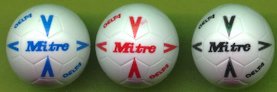
As sick jokes go, however, the '12-panel laceless (i.e. made after 1964) football' must surely take some beating, for here was a cheap replica of the exact ball that eluded Bonetti three times in England's defeat to West Germany in the 1970 World Cup. The makers even managed to get the exact colour match by taking samples from a beige Austin Allegro.

Can you imagine Bonetti wanting to be reminded of that when he put his name to such a gift set? Perhaps it's no wonder that he retired mid-way through 1979 to become a postman on the Isle of Mull in order to get away from such things.

Finally, as was often the case with mail-order catalogues of this kind, there was a selection of books to calm the minds of young kids and First Division goalkeepers everywhere. Not that there were any football annuals, mind - just a big old tome entitled 'Purnell's New Encyclopaedia of Association Football'.


Running to 190 pages, it was a fairly generic compendium of records, statistics and various other facts and figures, the like of which many kids (such as my juvenile self) found fascinating while waiting to become a mature adult. Whether the book was more fascinating than actually being a mature adult is a matter for personal opinion, but at least you'd have been happier receiving it as a Chirstmas present than 'Purnell's Pictorial Encyclopaedia of Horses and Riding'. Bleggggh.

-- Chris Oakley

All images featured on this post copyright their original owners and used for the purposes of review and illustration. No attempt at superseding original copyright has been made or should be inferred.

See also:

Wednesday 24 December 2014

The Football Attic Podcast 21 - Christmas Special

It's Christmas Eve (Christmas Day where Chris is) and Rich and Chris are selflessly giving up their time to waffle on about football related Christmas presents they got...or maybe wanted, but never did receive...they're both naughty boys after all!

So sit back, enjoy and Merry Christmas to you all!

Subscribe on iTunes or download here. Alternatively, catch The Football Attic Podcast on Square One Football Radio.

See also:
The Football Attic Podcast archive

Wednesday 17 December 2014

The Best of Collecting Panini!

Figurine Panini - two words etched into the childhood memories of seemingly every boy that ever lived. Who can forget the palpable excitement of walking into a newsagents, asking for two packets of Football 83 and watching as the shop owner randomly retrieved the desired items from the bulging box behind the counter?

Collecting pictures of your favourite football stars became the stuff of legend thanks to Panini. Yet for all the appeal (or should that be ‘a-peel’?) of those self-adhesive stickers, Panini weren’t always the image of perfection they’re often made out to be. With that in mind, we aim to detail what was good and what...well, wasn’t, about Panini sticker collecting.

With so much to cover, we’ve decided to handle the best and worst over 2 posts, so this time we revel in the warmth of its glory as we highlight Panini’s brilliance.

Collecting Stuff

You are a child, most likely a boy. You like football. You like ‘things’. You like collecting ‘things’. It therefore stands to reason that if you combine these elements you have a recipe for hooking kids in something more powerful than any drug known to man! Some (usually our wives) would say we haven’t ever grown out of collecting and if Rich’s football shirt collection is anything to go by, they’d be right. An interesting question would be ‘are they still as addictive as an adult?’. To answer that, Rich, Chris and a host of fellow bloggers set out to complete both the Euro 2012 and FIFA World Cup 2014 albums.

Despite our geographical disparity, the playground of the internet allowed swaps to happen, aided by detailed spreadsheets and the postal service. So was it as much fun? While it didn't have the same childlike wonder factor or the immediacy of hand-to-hand swapping, it was enough to convince Rich to buy the Limited Edition hardback version of the Euro 2012 album from Germany and do it all over again! A little tip for the modern day collector... eBay has plenty of opportunities to get hold of a box of 100 packets. Sure, it may fly in the face of everything Panini stood for, but it’s a hell of a lot quicker!

Opening The Packet

As a child (and maybe, cough, an adult), one of the thrills of Panini is that of the unknown. You've handed your money to the cashier, walked the requisite few paces away from the queue and now you have the packet in your hand. Your whole world stops until the only issue that matters is dealt with... what is inside?? Is there a shiny? Will there be a ‘special’? Or will it be QPR manager, Jim Smith for the 50th time? Also, will I accidentally tear through the stickers?

The sound of ripping paper accompanies a little gasp... and immediately you can see it - that hallowed silver edge of a team badge! A team photo! An action shot! A player that gives you your first full team page! AND JIM SMITH!!!!


Shinies / Foils / Badges

Whatever you called them, you were always transfixed by them. Every packet ripped open would potentially reveal a sparkling jewel hidden inside - a glittering club badge, a trophy or logo that seemed so much more special than all the other stickers. Panini knew this, and ensured that thrill remained an integral part of each collection.

They experimented with silver and gold foil, holographic foil - even silver-coloured cloth for their Football 79 collection - but whatever the material, shinies epitomised everything you collected Panini stickers for. It was sticky-backed bling for the under-15s.


Centre Page Features

As well as all the vast array of player pictures displayed team by team, one highlight of every domestic Panini album was the centre page feature. This could be anything from an FA Cup Final gallery with some of the images missing to an array of cartoon pictures illustrating the nicknames of various teams. Each idea was beautifully executed with subjects including old football kits and match day programmes given the exposure they deserved. Proving that a sticker album could be much more than 500 pictures of footballers, Panini’s designers pushed the boat out every year and we loved them for it.


Hairstyles & Facial Furniture

You don’t need to look too hard on Twitter to find pictures of Panini stickers where the subject is sporting a dubious moustache or a regrettable haircut. That’s because Panini did such a great job of immortalising the changing face of soccer personnel, we can only marvel at the vast number of pictures they printed. World Cups were always good for spotting strange-looking players, because for some reason us Brits always felt happiest when we were laughing at a Chilean with a mullet or an Austrian with big bushy sideburns. Two words of caution, however: ‘Peter’ and ‘Beardsley’...


Got, Got, NEED!

So you've got your album and a bunch of stickers and yes, sticking them in is fun and of course, collecting in itself is awesome, but after a while it does feel a tad lonely. But wait, your friends (you have those, right?) are also collecting Panini stickers - and they have ones you need and vice versa. And so we enter the world of swaps, also called swops or swapsies. Stickers were probably the first experience of proper bartering many a school child encountered.

Forget Economics 101 or Animal Farm, this was truly where you learned about supply and demand, how somethings are more equal than others; just how many normal stickers a shiny is worth is a debate which still rages today.

It also lead to truly mind-blowing moments when someone needed only one sticker to complete their album and would swap their entire collection of swaps to get it...which is how Rich came to witness approx 200 stickers changing hands for… it still hurts even now... QPR manager Jim Smith... which Rich had five of! Life is unfair - deal with it...

Next time: We commit sacrilege and name The Worst of Panini...

- By Rich Johnson & Chris Oakley

Thursday 11 December 2014

Fantasy Nostalgia: The Football Shirt Collection

Imagine a fantasy world where the greatest artists, designers and illustrators known to mankind work alongside football kit manufacturers to create Premier League team shirts...

Imagine...


-- by Chris Oakley

Thursday 4 December 2014

Chris O's Festive 5 - Subbuteo Christmas Presents

I was rather lucky, really. During my childhood, Christmas always delivered some wonderful presents to me every year, some of which were on the list I'd made, some of which weren't. I was never left dissatisfied and my parents, though never awash with money in the bank, always ensured I didn't go without.

I always wrote a list every year without fail, as many of us did as kids. In my mind, it was written to Santa because it was he, after all, that popped down the chimney and placed our presents in front of the tree on Christmas night. The fact that our chimney was blocked up and had an electric fire where a real one should have been might have told me it was actually my parents that were supplying the presents every year, but yet for some reason the penny never dropped.

Perhaps I didn't care. The sheer thought that you could write a list of items, hand it over to someone and expect to receive most of them a few days later pre-dated my Argos experience by several years, but it seemed to work brilliantly. If I do say so myself, I was always hugely grateful for the things that did arrive on December 25th, even if there were a few notable absences.

And yet for all that, I look back now and wonder what I could have received if only I'd put more thought into making my list. Take Subbuteo, for instance. I loved playing that iconic game of 'flick-to-kick' between the ages of 9 to 13, and yet I don't recall specifically asking for a Subbuteo-related present when the festive season arrived.

Granted, I had a nice collection of Subbuteo stuff anyway, but, well, you know... a bit more wouldn't have gone amiss. So what would I have asked for if I'd had the presence (or is that 'presents'?) of mind to write it on my Christmas list? I'm glad you asked, because here are the five Subbuteo items I'd loved to have unwrapped on Christmas Day many years ago...

1. Tango footballs (61205)

You can't play Subbuteo without a football, so it was lucky that the makers provided a wide variety for you to choose from. And boy, did I ever... I started off with the basic white and orange ones from my Club Edition set before moving on to the Tournament balls, the 'FIFA' balls, the Ariva balls and also a fine set of Mitre Deltas.

Yet the ones that I really needed - sorry, 'wanted' - were the Tango balls. Even now, I REALLY WANT a set of Subbuteo Tango balls... and I haven't played Subbuteo for 30 years or more.

They were available to buy in three colours - white, fluorescent yellow and orange - but the white ones would have been just fine by me. Just like the full-sized equivalent, a true example of perfection in design.

2. Football League Cup trophy (C172)

A bit of a weird choice, this, but it was one of those things that I was instinctively attracted to whenever I saw it on a Subbuteo poster or in a catalogue.

Again, I was lucky; down the years, I managed to attain a Subbuteo World Cup trophy and an FA Cup too, but there was something about the gleaming silver of that three-handled cup so often won by Liverpool in the early-80's that looked extra special to me.

Once you had a trophy, of course, you were obliged to play out a tournament with that as its ultimate prize. My mate Alan Young and I regularly did so, organising World Cup and FA Cup competitions that often took several weekends to complete. But here's the thing: if we'd had a League Cup trophy, we might have felt more obliged to incorporate lower-league teams into our tournaments.

Yes, I admit it - with the teams available in my collection, our FA Cup games did tend to focus on the bigger teams like Manchester United and Liverpool rather than the Darlingtons or the Chesterfields of this world. Maybe that would have been different if we'd have played a League Cup tournament instead. Maybe.

3. Astropitch (C178)

Even now it seems extraordinary to me that Subbuteo should have the ambition and the sheer boldness to create an 'artificial' playing surface, and that's without acknowledging the artificial nature of a green cloth pitch anyway.

Subbuteo's Astropitch arrived in 1980; not, as you may think, a reaction to QPR's Omniturf being installed at Loftus Road, but instead as an homage to NASL where plastic pitches had regularly been in use for several years.

Back in the day, I knew about the Astropitch but didn't care much for it... until I visited the house of my school friend, Trevor Scannell. Unbeknown to me, he was also a Subbuteo fan and was able to prove so by showing me the long green cardboard tube that housed his Astropitch.

I was awestruck. The tube was heavy, and on closer inspection I discovered why - it was because of the rubber backing that the green felt playing surface had. How amazing that you could unroll a pitch that was faultlessly smooth, thereby ensuring a perfect roll for your ball of choice (see above).

From that moment on, I wanted one and yet I never asked for one when Christmas came around. I wonder why? Certainly it seemed expensive to me at the time. It cost £8.50 on release in the shops - the equivalent of around £37.50 today - so it certainly fell into the category of 'special treat' as an ideal festive gift idea. If only I'd have been more strategic in my Christmas list making...

4. Teams (various)

As I mentioned on our fourth podcast, I had a decent core of teams in my collection, many of which were versatile enough to double up as various others. Because of this age-old tactic, there weren't many teams I couldn't include in my competitions, but there were a few that somehow eluded me which would have been a worthwhile acquisition.

Of the international teams that were big back in the early-80's, I'd have very much liked Argentina - partly because those pale blue and white stripes looked terrific, but also because I couldn't replicate the look with another team.

Then there was Peru - an outfit with an almost universally admired kit design - and one which I defiantly used in competitions despite not actually owning it. That was thanks to the almost similar Crystal Palace team that I did own (damn that blue diagonal sash), but let's face it, only the real Peru team would've done, and for that reason I'd have included it on my Christmas list.

Finally, if you're talking about team colours that were strangely missing from my collection, two stood out - green and orange. For the latter, it was only really Blackpool that might have tempted me to make a purchase, but as I admitted earlier, I was never much bothered about lower league teams (Blackpool were in Division Three or Four back then).

So that just leaves green-shirted teams and for that I'd have certainly liked Northern Ireland for my World Cup competitions. Billy Bingham's men had not just qualified for the 1982 World Cup but also gave a good account of themselves, so for topical reasons they'd have been a great team to own. And let's not forget, I could have pretended they were the Republic of Ireland team too, if necessary. Two for the price of one - beat that for cost-effectiveness.

5. World Cup Goals (C130/61130)

Something of a luxury item for me, but how I'd have loved to own them. These were goal frames with nets coloured red and blue - nothing more, nothing less - and yet the introduction of that splash of colour excited me more than most things in my life as a juvenile 10-year-old.

My original Club Edition set had given me goal frames with a plastic bar across the back of the net. This was restrictive beyond belief because you couldn't lift your goalkeeper to block those high shots heading for the top corner of the goal.

That's why I quickly invested in a set of Tournament Goals - pretty much the same as the World Cup Goals, but the nets were plain white. Very nice looking, but more importantly a joy to use as they lacked a plastic bar across the back. Suddenly the mobility of my goalkeepers was (almost) limitless.

All very good, but given the choice, would you rather have had goal frames with a white net, or a dazzling continental-style red/blue net? I thought so, and I agree completely. A World Cup Goal for a World Cup competition would have been the icing on the cake for me, but then again so would any of the above items I've mentioned. Therein lies the beauty of the unattainable in the captivating world of Subbuteo.

-- Chris Oakley

Sunday 30 November 2014

The Football Attic's Top 30 Retro Football Twitter Accounts

If football nostalgia's what you live for, then indulging in your passion is what makes life so great - and where better to do that than on Twitter where the world is undoubtedly your oyster?

In the 33 months we've been on Twitter, we've marvelled at the huge community of people that share our love of football's magical past, whether their interest be focused on great players, great matches, great memorabilia or great football kits.

But with thousands and thousands of accounts to follow, which ones should you really be looking out for? The answer is not as difficult as you might think because we at The Football Attic have sorted the wheat from the chaff to bring you our list of the Top 30 Retro Football Twitter Accounts.

Here they are in no particular order, so enjoy - and get following!

1. @ChapmansArsenal
A delightful real-time account of all that was happening to Arsenal in 1930, full of period details about the players, goals and events from 84 years ago. Painstakingly crafted by Graham Sibley from The Sound of Football podcast.

2. @TheSkyStrikers
Photographic gems from an unending seam of match-day programmes are served regularly and with relish here. Lovers of 70's and 80's football will particularly delight in this eclectic parade of retro memories.

3. @ScotsFootyCards
A real giant on Twitter when it comes to classic photographs from a wide range of eras. Source material typically comes from Shoot magazine and Topps collector cards, but not exclusively so, and certainly not just for Scottish football fans!

4. @GoldstoneRapper
When it comes to single-club retro football accounts on Twitter, you won't find many better than this one, along with its accompanying blog site, The Goldstone Wrap. Covering every possible aspect of Brighton & Hove Albion's diverse history, this is a loving tribute to The Seagulls for everyone to enjoy.

5. @TheLeagueMag
One of the most comprehensive compendiums of retro football imagery on Twitter. The League Magazine focuses on everything from players and teams to old football programmes, printed adverts and everything in-between.

6. @OldSchoolPanini
French-language project with a superb accompanying website, but the Twitter channel alone provides lots of great sticker-related imagery. In particular, keep an eye open for 'Through The Years' - a medley of sticker pics focused on one player or coach at different stages of their career.

7. @Retro_Shirts
If you like collecting old football shirts, you'll know that finding a decent source is everything. Luckily, Retro World Football Shirts are on hand with lots of tempting items to purchase, many promoted on their Twitter timeline.

8. @Football_Retro
...or Football Nostalgia to use their proper name, are another fine purveyor of well-chosen imagery from football's rich past, covering great football shirts, crowd shots, well-known players and top matches throughout its archive.

9. @MaradonaPICS
Observe the life and times of arguably the greatest player that ever lived through this wide-ranging selection of photographs featuring Diego Maradona. On and off the field, there's plenty to wonder at and enjoy...

10. @PeleOutOfContxt
If, however, you like your legends ever-so-slightly ridiculed, you'll appreciate this Twitter feed that shows Pele in a variety of real-life scenarios. A nice combination of gentle humour and great pictures.

11. @TrueColoursKits
If you love talking about great football kit designs from the past, you need to follow the illustrator supreme, John Devlin! With links to his latest work on the True Colours website plus great insights into football kit production, John's your man for engaging chat on everything from Adidas to Xara...

12. @GoalPostBooks
Better known as 'Victorian Football', this is a splendid source for articles about Vintage Era soccer. Taken from the book 'The Victorian Football Miscellany' and its partnering website, you won't fail to be drawn into a world of football full of stories both captivating and illuminating.

13. @RetroPunishment
All the fun and humour of football nostalgia distilled into sublime videos and delightfully funny tweets. Retrospective Punishment is the perfect antidote to modern-day football and all its deplorable drivel.

14. @AdmiralSportsUK
Think 'classic football kits' and the name Admiral is sure to quickly follow. Now you can recall all those great designs worn by teams in the UK and across the world by following Admiral Sportswear themselves. With lots of great photos to feast your eyes on, you'll be glad you did.

15. @Football_Hist
Football & History - the perfect combination, amply proven on this Twitter account filled with random memories of all kinds. From newspaper cuttings to videos, cartoons to player photos, this plundering of the past is well worth a follow.

16. @ColdWarFoot
Being niche is never a bad thing, and that's proven unequivocally here as the spotlight is turned on retro football from behind the Iron Curtain. Something a bit different, but a worthwhile addition to Twitter's band of football nostalgia followers.

17. @MueFootballHist
If you've ever wanted to watch some great retro football on YouTube but needed some inspiration on where to start, look no further than Library of Football on Twitter. There's a regular supply of links to great games and heaps of stuff you didn't even know was online - a wonderful resource.

18. @HistoricalKits
Follow the efforts of Dave and Matt as they strive for the specific detail that goes into the illustrations on their excellent website, historicalkits.co.uk. As if you needed an excuse to pore over vintage photos stretching back to the early 1900's...

19. @FootballMemorys
Yet another Twitter account dedicated to classic football imagery, but this one focuses on great teams and great players. Any era you chose to mention is covered with rare delights waiting to be discovered both in colour and in black and white.

20. @BCAFCobjects
Specifically of interest to Bradford City fans, you may think, but like all good clubs, a strong following is often gained by the memorabilia it produces. That's why all football fans will smile at this collection of bookmarks, pin badges and other ephemera, all with that special Bantams touch.

21. @FootballInT80s
Random memories from the 1980's in the form of photos and video clips, usually accompanied by interesting bits of information to timestamp their historical context. As enlightening as it is entertaining.

22. @90sFootball
If the following decade is more to your liking, however, 90's Football does a brilliant job of combining great pictures and video clips to recreate the era of Cantona, Baggio, Shearer and many others.

23. @Footysphere
This Twitter account is a must-follow for nostalgic Sheffield United fans, but the accompanying website provides an even more diverse and eclectic range of imagery including postage stamps, cigarette cards and fine photography.

24. @VintageFootClub
Another French Twitter account, and one that delves deep into the world of classic European (and particularly French) football. You'll find great pictures of top football superstars plus lots of team photos and links to the excellent Vintage Football Club blog site. C'est magnifique!

25. @AntiqueFootball
A nice selection of pictures from the very antiquated to almost the present the day, many of which you won't have seen before. European football features regularly alongside material from the UK but everything presented is likely to make you smile for a variety of reasons.

26. @TWTDAMF
'Those Were The Days - Against Modern Football' isn't all about football, but The Beautiful Game does dominate this appealing collection of imagery covering everything from scarves and hats to kit design and memorabilia.

27. @MartinMarty1974
Leeds United Memories provides just that with a diverse and pleasing array of imagery that mainly focuses on the great Elland Road heroes of the post. From the 1930's right up to the present day, this is another well researched club-centric Twitter resource.

28. @Cardinal_Tales
There aren't enough retro football accounts on Twitter that take non-league football as their subject matter, but this one on Woking FC makes up for that with lots of great imagery covering many decades.

29. @MotherSoccerNL
A wonderful mix of football photographs spanning all eras and nationalities. Tweets are in Dutch as well as English, but the imagery is universal in its appeal, be it funny, thought-provoking or downright silly.

30. @ClassicoCalcio
A newcomer to the retro football blog scene, but already proving a worthwhile addition to the fold. Articles about George Best and Norman Hunter along with features on great kits and imagery get a mention on their Twitter timeline, with much more of the same surely to come.


Honourable Mentions

@tgbjimmy
As always with trying to create a definitive list, there's always some that only spring to mind too late, but that definitely deserve a place. This is certainly the case with @tgbjimmy, who maintains the excellent site, The Glove Bag, which is dedicated to the niche subject of goalie gloves, featuring a huge archive of vintage ads for all things keeper related. Well worth a visit and a follow!

@ClassFootStick
If Panini stickers are your thing, then you need to follow Classic Football Stickers - not least because you'll get regular updates on what's new at their beautiful website. Be warned, however... once you start browsing all those Panini page layouts, you'll be there for hours!

@OldShirts
How we missed this one, we'll will never know...possibly the ultimate collection of "old shirts" on the net, with approx 55,000 shirts to date; the awesome oldfootballshirts.com. Incredibly useful as a reference for shirt histories, especially for those rarer items, There's even a few of our own shirts on there!


With sincere thanks to all of you that submitted nominations for our list - we really appreciate it!

-- Chris Oakley

Friday 28 November 2014

Crimes Against Design: Shoot League Ladders

Where football nostalgia is concerned, there are few things that can rightly call themselves 'legendary' like Shoot's League Ladders. We've discussed them at length before and spoke of them in unashamedly exalted tones... but say it under your breath - certain elements of it were really badly designed.

Like the very best aspects of football memorabilia, perfection can be rendered cruelly unattainable due to an oversight in someone's artistic interpretation. An issue may arise with a detail so slight or insignificant, yet if it dealt with by a ham-fisted chimpanzee with sawdust for brains, it can quickly unravel all the good work done elsewhere.

In the case of those classic League Ladders, there was always one thing that bothered me as a kid that no doubt bothered many thousands of other young football fans too. It was those tabs. Not all of them - just the one or two here or there that for some reason weren't coloured correctly.

At this point, I call upon the Tottenham Hotspur fans of this world to answer one basic question: How annoying was it that for years the Tottenham tab was always coloured blue, just like those of Everton, Ipswich, Birmingham and sundry other blue shirt-wearing teams?


It was ever thus from the first Shoot ladders in 1969/70 right through to 1987/88 when someone at IPC Magazines finally realised that Spurs actually played in white. But Tottenham weren't the only offended party throughout the annual cavalcade of cardboard conviviality. Preston and Bolton also had a case of the blues for many years, when white would have been more appropriate.

A quick look at that original set from 1969 reveals other abnormalities. Bradford Park Avenue (confusingly shortened to 'Bradford' while their City neighbours played one level higher in the Third Division) were given a green-coloured tab. This smacked somewhat of laziness as Bradford Park Avenue had ditched their white shirts with green trim two years earlier in favour of their traditional white with red and yellow hoops. Hardly a fitting tribute for Avenue's last year in the Football League.


To add insult to injury, Orient suffered in a similar way that season too. Though famous for wearing red throughout much of their history (including the 1969/70 campaign), Orient wore blue for 20 years, but that all ended in 1967... so why the blue tab?

The colour blue was in fact the root cause of many tab-related Ladder issues of the 1970's and early 80's. Ask any fan of Coventry or Man City - they'll tell you that Shoot only used to have one type of blue ink, and it certainly wasn't the 'sky' variety.


There also appeared to be a glut of black ink doing the rounds for a long time, and it was often used in a bewildering number of situations. To explain, the general rule of thumb for designing each of the tabs went as follows:

  • Main/background colour of the tab = the predominant shirt colour for that team
  • Name of the team on the tab = the secondary colour on the shirt of that team
So far, so logical, but what happened with Watford, Wolves, Derby, Port Vale or Fulham? None of those teams played in black shirts (although who did?), so why not give Watford a yellow/red tab, or Fulham a white tab with black writing? It certainly wasn't unheard of for Shoot to make white team tabs (although the practice seemed largely reserved only for Leeds for a fair while), so why so many black ones?


In the mid-70's, it became particularly clear that Shoot had little idea which colours ought to be used for certain teams, and reserved the right to celebrate that fact in whatever way they deemed fit.

Southport in yellow and black? No way - Shoot says 'black and pink'! Crystal Palace in red and blue? Certainly not - Shoot says 'purple and white'! Northampton in white and claret? Nonsense - Shoot says 'dark lavender and white'! And so on, and so on...


Now you may be thinking that this is all futile nonsense of the highest order, but I'd put money on any number of young children writing to Shoot every year to ask why their team wasn't shown in the right colours. The act of identifying teams by the hue of their kit always was and always will be a key stage of every young fan's football education, so it's fair to say errors of this kind could have caused confusion on a massive scale. And we haven't even discussed teams that wore stripes and hoops yet.

What's done is done, however. Despite the ongoing cult worship of Shoot's League Ladders in the modern era, their legend-like status, based on the evidence above, is no doubt flawed much more than anyone ever realised. Then again, no-one ever kept their ladders updated for an entire season because we all got bored with them after a few weeks, so who said they were perfect anyway?  How the passing of time plays tricks with your memory...

-- Chris Oakley

With sincere thanks to Football Cartophilic Info Exchange for allowing us to reproduce the images shown.

Friday 21 November 2014

Whatever Happened To... Nasal Strips?

Tunes, it seems, are not the only things that help you breathe more easily. For a short spell in the mid- to late-1990's, another ingenious device - some say a fad - proved just as adept at opening your nasal passages as the sweet lozenge of yore. Or was it?

Robbie Fowler was a Liverpool striker with an incredible talent for scoring goals, but one thing was letting him down - his ability to breathe in more air through his nose than he'd have liked. Despite the fact that his nostrils seemed perfectly capable of doing their job properly, he searched for a way to increase his 'intake yield.' *

What he found was the Breathe Right nasal strip, a "spring-like band" that sticks to the top of your nose and gently opens the nasal passages. For an all-too-brief spell back in the mid-90's, every athlete on earth seemed to be wearing one, all seemingly encouraged by their ability to take in more air during physical activity.

And so it was that Brer Fowler felt obliged to join the ranks of the world sporting elite who were decorating their noses with these funny-looking plasters. It was said that these nasal accoutrements improved air flow by 31% and even helped reduce snoring for those that were so afflicted. Sadly their introduction came too late to be tested on fans of Graham Taylor's England team, but their popularity was beyond question only a few years later and for many years hence.

As it is, there was much doubt poured on this revolution in assisted breathing, some claiming the whole thing to be complete hooey. Dr. Beat Villiger, a Swiss sports specialist invited by FIFA to test the viability of nasal strips, claimed that when the human body was really exerting itself, breathing usually switched from the nose to the mouth anyway, in order to pull in more air.

So in other words, the benefit of wearing one only became apparent if you were doing anything less than a full sprint. Or to put it another way, wearing a nasal strip was a way of telling people that you were so unfit, you needed a bit of help from a plaster to get you through 90 minutes of occasional exercise. Hardly surprising, then, that we don't see them worn much today.

That said, perhaps they just haven't been marketed right, or indeed aimed at the right people? For a device that gently opens up small apertures to improve performance, surely they could be worn on the anus to help TV commentators get more of their words out, or across the eye sockets to give World Cup hosting administrators a wider view of what's going on. Just a thought...

* Made up terminology.

-- Chris Oakley

Thursday 20 November 2014

Videoblog 6: The Encyclopedia of World Football (Marshall Cavendish, 1980)

Way back in July 2013 when we recorded our podcast on Football Books, Rich asked Chris whether there were any books he loved enough to warrant him running back into a burning house to rescue from its raging inferno. Chris answered that one particular title would be worthy of that life-threatening course of action, namely the Encyclopedia of World Football.

Sixteen months on, Chris finally tells you all why he loved the book so much in Videoblog 6 (see below). For fans of football kits, badges and general miscellanea, this is a great old book that's well worth hunting down on eBay and other online auction sites.


Sunday 16 November 2014

Got Not Got CCFC & Kit Book Review

Last year we reviewed the 2nd incarnation of the retro football bible, Got, Not Got and a few of the spin off titles that were starting to appear alongside it. There's no new version this year as instead, Derek & Gary have been busying themselves creating a wealth of club specific volumes, ranging from the giants of Man U and Liverpool, to the smaller, but no less loved clubs such as Norwich.

Falling neatly into that last category is The Lost World Of Coventry City.

This book holds a very special place in my heart, not only because of the team in question, but also because I was able to contribute lots of my own memorabilia collection to its hallowed pages. NB...most of the pics in this review might just well be of pages with my stuff on, cos...hey, it's my review ;-)

On top of that, anyone who's listened to our podcasts will know how often I've bemoaned the sheer lack of attention Coventry has had down the years, so to have an entire book all to ourselves is bliss!

Following the usual GNGLWoF format, this is just chock full of pretty much everything you could imagine that's ever been produced with the CCFC name on it, from the standard club programmes, Subbuteo & Panini, through the more obscure stuff like myriad pin badges and CCFC gnomes, culminating in what must be the nadir of Coventry City memorabilia, the Cup Final 7", "Go for it City".

OK, so the single itself may not be all that bad and of course, anything to do with that Cup Final will always be endearing to any CCFC fan, but the B side, "Go for it Cupid" (my heart, shooting to win) is possibly one of the worst pieces of music ever set down on vinyl!

There are pages dedicated to Coventry's kit manufacturers down the years including the iconic Admiral & Hummel and the possibly less remembered Ribero, covering the infamous chocolate brown kit and of course, the test card shirt from the late 80s.

As with every other Got Not Got book, the joy is not only in the sheer wealth of material covered, but also the depth of knowledge shown in the writing. If you are a Coventry City fan, you simply have to own this book and the same goes for fans of the other clubs who have also had the "Lost World Of..." treatment thus far,


The second book on review here is another that has me firmly within its target demographic. If I wasn't spoilt enough by a book all about Coventry, "Shirt Tales & Short Stories - The Lost World of Football Kits" is surely the icing on a book shaped cake.

Covering English clubs from Arsenal to Wolves, it also features a selection of Scottish teams and a page for each of the home nations.

Each team is given a double spread featuring several kits from their history, covering both much loved classics and also the ones some would rather forget along with text detailing the selections and a brief history of the clubs' shirts.

A large amount of the photos are from the vast collection of Neville Evans who runs the National Football Shirt Collection, and these lend a real air of quality to the book, with each of his shirts lovingly and professionally photographed.

As well as the shirts themselves, scattered throughout the book are kit adverts from the 70s, 80s and 90s as well as shots of the kits in use from the time.

As with the CCFC book, if you have any interest in football kits whatsoever, this is an absolute must! It may not cover every club going, but those that it does are given the VIP treatment...and of course, that means there's room for a Volume 2!

- Rich Johnson


Saturday 15 November 2014

Panini: Football 82

Let's see who's looking through the... ROUND window...

Yes, Panini's 1982 collection featured players gurning, grimacing and squinting through a circular frame on many of its 516 stickers. It was the fresher look that the Football 82 album was based upon, although many familiar features remained throughout.

Once again, the front cover changed colour, this time using pale blue to top and tail a great action photo from a match between Tottenham and Manchester United. Though the picture was nicely composed, however, one has to wonder how many kids had sleepless nights over the thought of Sammy McIllroy's gruesome missing right hand.

Inside, the old double-page spread was employed for each of the English First Division teams, the major change this time being that the player biographies were now enclosed in two columns either side of the fold, rather than underneath each sticker. And then there were the new stickers themselves which now featured the name of the league and division in the top corners and a slightly restyled bottom section to show off the name of the player.


From Arsenal to Wolverhampton Wanderers, the bright new face of English football came shining out. Silky shirts with pinstripes, smart haircuts and smiles were all in plentiful supply as players old and new adorned Panini's pages. Check out Southampton's army of ageing greats such as Alan Ball, Chris Nicholl and Mick Channon - all comfortably in their thirties - situated a turn of a page away from Stoke's youngsters including Lee Chapman (20), Adrian Heath (20) and Paul Bracewell (19).


Elsewhere, we had our first ever sight of Swansea City in the First Division, along with Notts County who were back in the top flight for the first time since 1926. For Leeds United, however, this would be their last season at the highest level of English football until their next tilt at the League Championship came along in 1990.


The foil badges in Football 82 were spruced up in all their gold finery with clearer lettering and a pleasantly contrasting silver border providing an improvement on the previous year's efforts. They added a decent splash of glitz not only to the First Division and Second Division pages, but also now the Third Division pages too, albeit in a half-size format. This meant your average junior collector was likely to get a rare glimpse of the impish Lincoln City badge or Reading's building society-esque depiction of some trees and a river.


For the Scottish Premier teams, two players yet again had to share a single sticker, although the manager of each team was now given one of his own in full size format, and again the Scottish First Division teams were each given their own team picture.


Yet apart from the opening 'Players of the Year' section that mirrored Football 81, there was no main feature showcased in the middle of the album. Granted, the 1980 FA Cup Final section in the previous year's collection wasn't the most exciting thing ever, but at least it provided a contrast to the usual 'badge-team-player' routine found on all the other pages.


Instead, the album closed with a tantalising message telling us to "Look out for Espana 82 - Panini's great World Cup collection" due to appear in shops in April 1982, and a back cover promotion for Subbuteo's six-a-side game, Top Scorer.


Despite continuing the high standards of previous efforts, it could be argued that with Football 82 Panini used the 'if it ain't broke, don't fix it' approach by barely straying from its tried and tested format.

But that, however, was about to change. For Football 83, some new ideas were set to bring a breath of fresh air to Panini's annual stickerfest, and for the more traditional fans, they may not necessarily have been for the better...


-- Chris Oakley


See also: